Letterforms Outside the Box
/
I discovered hand lettering in sixth grade, one rainy day poking through my mom’s studio in the attic. She had a little graphic design business on the side—on the side of what I was never sure, but between that and the darkroom in the basement it gave her every excuse not to engage with my dad, who had custody of the rest of the house. But she let me do anything I wanted up there: look through her collection of art books, use any of her cool materials—dip pens and mechanical pens and dyes and watercolors and big pads of thick cold-pressed paper. I was a careful kid, asked before I used anything and always cleaned up after myself, so I was always welcome, and it was a fine place to explore.
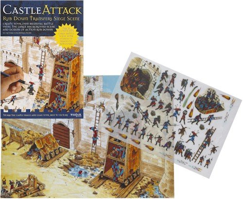
I already had a low-level fascination with type, and liked to look covetously through her big envelope of Letraset sheets, which I probably liked originally because they were a step or two up from the rub-ons I loved so much when I was little—the term for them, technically, was “rub-down transfers,” sheets of little dry picture decals that you could transfer onto the panoramic board backgrounds they came with—but that’s what we called them. In retrospect they sound kind of boring, but there was a certain hypnotic pleasure in placing each one in just the right spot, thoroughly rubbing the back, and pulling away the plastic—oh, the suspense!—to see if it had worked completely, or if you’d have to try a second time to transfer the other half of the image, and the edges never quite lined up. Letraset was like that, but I was also entranced by the letterforms themselves. I’m not sure I’d ever thought about the physical lines and shapes that made up the words in the books and comics I loved, but this made me consider them, and I liked the artistry involved.
Letraset was expensive, though, and I knew better than to use up my mom’s just playing around. But I found something almost as good, for my experimental purposes: a thick black three-ring binder with some 500 pages of fonts, full alphabets in graduated point sizes, from the conservative Times New Roman to any number of far out decorative typefaces. Octopuss. Lazybones. Motter Umbra. Tango. Sinaloa. This was the ’70s, and type was weird. But all I needed to experiment was tracing paper, a sharp pencil, and a radiograph to ink the finished product in. I spent hours out of my nerdy pre-teen life playing around with letterforms, and eventually started a little business doing custom lettering jobs—mostly for the front of other kids’ notebooks or textbooks, where I’d carefully rubber-cement the tracing paper onto Bristol board and proudly hand the finished product over for a couple of dollars.
I was still hand-lettering up until I got to art school, which had a computer lab. And then my agonizingly slow tracing days were over—you could do anything with some scalable fonts, Microsoft Word, and a little patience. I swapped free fonts with friends the way we would music a few years later. But I never lost my love for nicely handcrafted letterforms; I like to make them, and I like to look at them. Computers may have killed the necessity for hand-drawn type, but what is being made has a rapt audience online, and there are no end of variations.
Which is an awfully long-winded way of introducing a few of this week’s typographical finds.
 First off, via Taxi, Nicola Yeoman’s letterforms. The collection isn’t a full alphabet, but assemblages of materials that form letters, and accompanying photos that deconstruct them, breaking them down into details. They’re haunting and exquisite—I think the letter D is my favorite, though the New York Times Magazine-commissioned T, with its scaffolding of branches, is a close second.
 On the less mysterious side of things is designer Tommy Perez’s food alphabet, which he created for—and with—his 2-year-old daughter Zoë. As Perez explained to Fast Company Design, it was a way to teach her the ABCs but also get her involved:
Zoë has always had an interest in helping or contributing to whatever I was working on…. Whether it be building something or sketching, Zoë always wanted to be doing the same. So when I shifted to freelancing from home, I wanted to make sure she had something fun and creative that was just her own.
Plus, he says, she gets to eat the finished product, which includes hummus, olives, quinoa, and sunflower seeds.
 Finally, we have Christina Vanko writing in The Atlantic about sending all her text messages in calligraphy for a week. And while the temptation is to dismiss it as gimmicky and cute… it’s a great gimmick. And it is cute. Plus, as projects go, it turned out to be pretty interesting; she logs her friends’ responses (“It’s like you’re deaf and you’re writing down your response to everything. You should do this to ppl in person haha”) and questions (“Have you made like a go-to standard phrase page with like “lol” and “I know right?”). Aside from the more predictable discoveries—that writing everything out made her more thoughtful about what she was saying and how—I thought it was interesting that even with the expressiveness of handwriting, she missed the convenience of emojis (and used selfies instead).
So there you are, three artists whom I wouldn’t necessarily term typographers or calligraphers, who’ve taken advantage of the visual and conceptual resources of both arts. So much of my reading lately tends to be in pixel form, or e-ink, or just so content-dependent that I wouldn’t notice a beautiful ampersand if it fell out of the book and broke my toe. But it’s good to think about letters, and lettering, and what goes into the parts that make the whole.
(Images, top to bottom: Octopuss font; “Letter D” © Nicola Yeoman; “Letter Q” © Tommy Perez; Christina Vanko for The Atlantic.)


